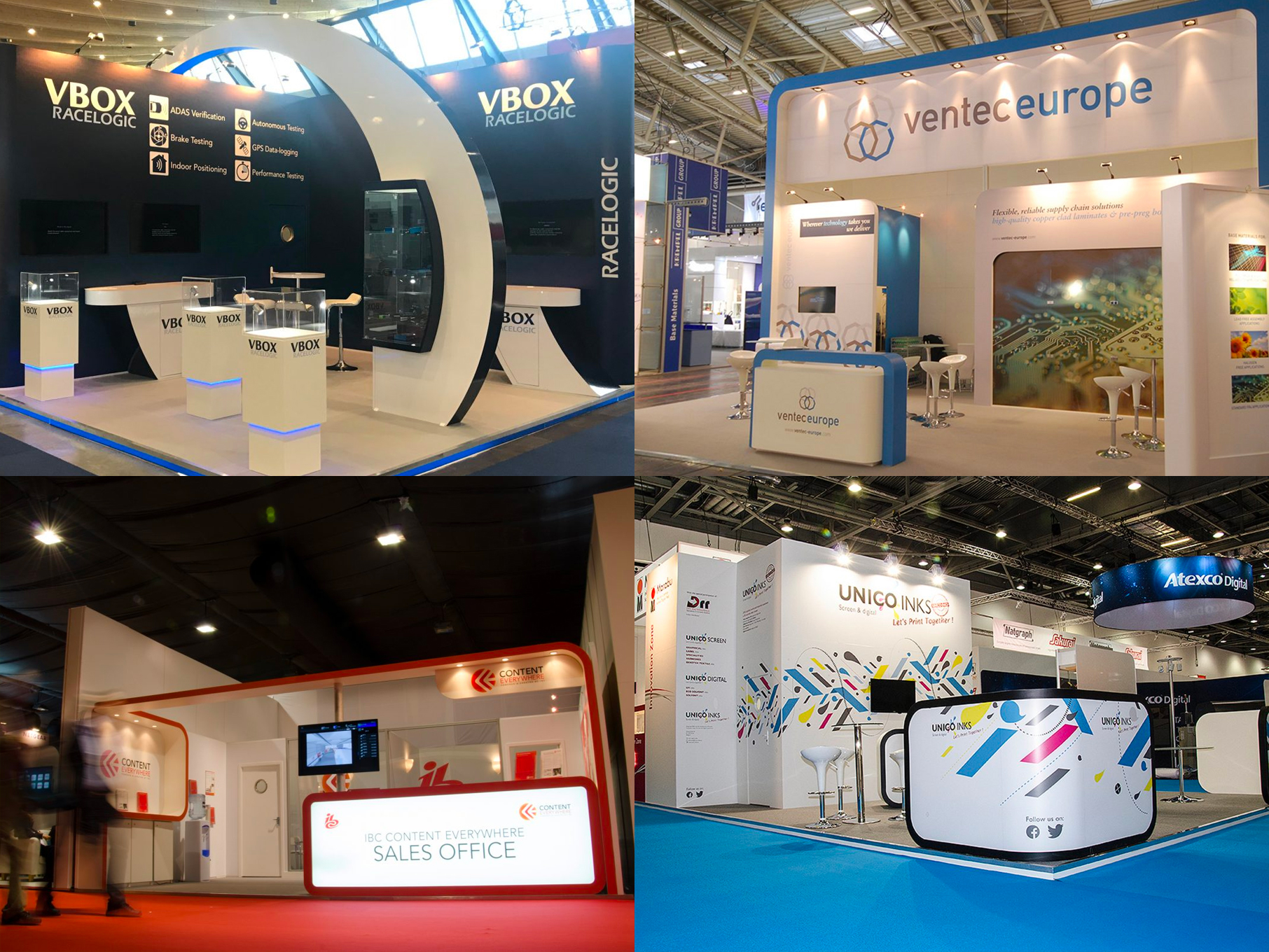
While the temptation might be to scrimp in this area, the impact of poor quality graphics is not worth the risk. Exhibition stand graphics that look great and stand out needn’t cost as much as you think and can be a cost effective way of promoting your company. These are our tips for making the most of your exhibition stand graphics.
- Go bespoke or keep it simple. If your budget will allow, commission a graphic designer – this will result in far better messaging and promotion of your brand and is good value for money. If you can’t afford a professional, then keep it simple – stick to clean, clear typefaces and don’t try and jazz it up with images, clip art etc.
- Stick to your brand guidelines. If you’re engaging a graphic designer, make sure they’ve got a copy of your brand guidelines including typefaces, colour references, logo variations and protection zones etc.
- Home made won’t cut it. Unless you’re lucky enough to have a really high quality industrial printer in your office, don’t try and print your own. In comparison to your competitors stands, your home made printed signs will look shoddy and cheap. Poor pigment saturation and the lack of definition will mean that your graphics are hard to read from a distance, putting you at another disadvantage in comparison to your competitors.
- Speak to your event contractor. Often your event contractor will have negotiated preferential rates for stand graphics, particularly for shell scheme or modular stands where the print areas are uniform across a number of stands. This offer is almost always worth taking up, as it’s a good, high impact use of your budget and you’re unlikely to get a better deal by going it alone.
- Check, check and check again. There’s nothing worse than a typo in two foot high letters, so don’t check proofs with tired eyes at the end of a busy day in front of a computer screen. If you can, get a colleague to check the proofs too – sometimes a fresh pair of eyes are required to spot even the most obvious of mistakes.
- Be aware of deadlines. You will end up paying more if you have to get a rush print job, so find out what the print deadlines are as soon as you can. Earlier print runs also allow you time to correct any typos or inconsistencies.
- Go big. If your budget won’t stretch to custom sized graphics (i.e. made to fit your stand), have your simple graphics (see above) printed to the largest size possible. A tiny A4 sign lost on a vast empty white wall will look cheap. Roller banners and banner stands are a better option for limited budgets, as they look professional and are reusable.
- Don’t forget fixings. Make sure you have an effective way of keeping your graphics up. Banners sliding down walls not only look unprofessional and sloppy, but will distract you from your key objective of engaging with your exhibition stand visitors.
Contact us if you need any help arranging your exhibition stand graphics.

